top of page
TEAM MANAGEMENT PLATFORM
My Teams
ROLE
Lead Designer
PROCESS
Ideation
Product Design
TOOLS
Figma
FigJam
DURATION
4 Months
.png)
Project Description
Background
My Teams offers a dedicated manager platform that unifies key HR workflows into a single, intuitive application. This integration eliminates the need to navigate multiple systems, creating a more seamless and efficient experience. My Teams serves as a central access point, providing managers with the tools and resources they need, including hiring, onboarding, learning, and more.
The Challenge
The current landscape of manager tools presents a significant challenge to efficient team management and hiring. Fragmented across disparate systems, these tools lack integration and visibility, forcing managers to rely on manual processes. This disconnected experience hinders timely decision-making, extends feedback loops, complicates team collaboration, and ultimately impedes their ability to effectively build and manage high-performing teams.
How might we create a unified and integrated platform that empowers managers to efficiently build and manage high-performing teams?
Process
Research
Prior to my involvement in Phase 2 of iterations, user research and testing were conducted on both prototypes and initial designs. This foundational work provided valuable insights into user perceptions and pain points. The following summarizes key findings:

Positive Feedback
-
Finding Information: Locating associate information within team member profiles was intuitive and easy.
-
Understanding Information: Users readily understood that cards on the landing page represented associates reporting to them.
-
Exit and Transfer Clarity: Users found the list of steps and statuses within the Exit and Transfer sections of associate profiles very helpful.
Areas for Improvement
-
My Org Tab: Four out of five users did not understand the tab's purpose or how the individuals listed related to them.
-
Associate Action Button: Users had incorrect expectations regarding the functionality of the associate action button. Four out of five users anticipated a wider range of actions, whereas it currently only allows for transferring associates.
-
Pending Transfer: All four users tested, expected pending transfer associates to remain visible under their current team until the transfer was finalized. The current design, which removes them immediately and places them into a new section. This has caused confusion that has been disruptive to their workflow.
Ideation
Building upon the insights from previous research and testing, the product manager and I collaborated to prioritize the most actionable refinements to previous designs.
Our focus was on addressing key user pain points identified in the research, which led to the following 'How Might We' questions:
-
How might we clearly distinguish the 'My Org' and 'My Team' sections to eliminate user confusion?
-
How might we create a button label that accurately and concisely communicates the 'associate transfer' function?
-
How might we visually distinguish and display which associates have a pending transfers status within the team?
Solution
"My Org"
The 'My Org' section proved to be a distraction rather than a valuable feature, consistently causing user confusion. Consequently, we made the decision to remove the 'My Org' section entirely.
With this change, we explored merging the 'My Team' tab with the 'Summary' and 'Hiring' tab navigation, renaming it 'Associate' to differentiate it from the 'My Team' mini app. This strategic move significantly improved the navigation hierarchy, elevating the 'Associate' tab to a primary level and providing a simpilier and direct user experience.
.png)
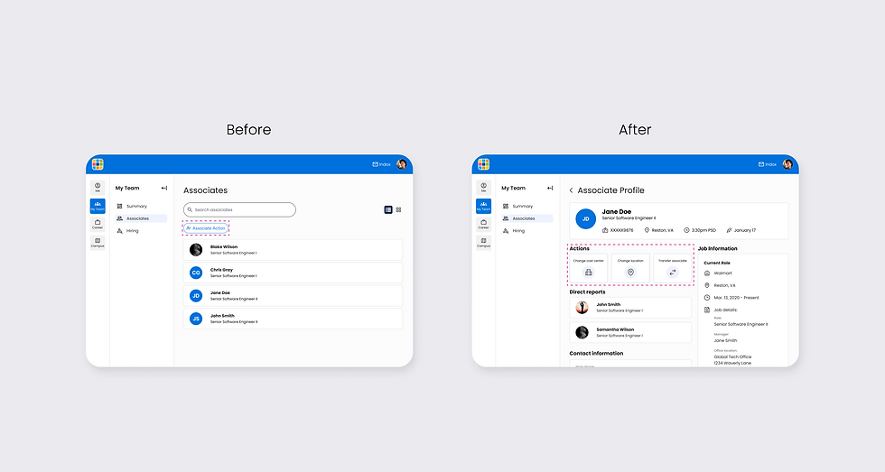
Associate Actions
The 'associate action' button caused significant user confusion by failing to clearly communicate its sole function of transferring associates. To resolve this confusion and ensure future scalability, I separated each action into its own clearly labeled button and integrated these actions directly into the associate's profile allowing for direct action.
.png)
Pending Transfer
We recognized that pending transfer associates and the nested tab design were causing significant user confusion and hindering navigation and information hierarchy. To address these issues, we removed the nested tabs and ensured team members remained visible until transfers were finalized, aligning with user expectations while increasing discoverability.
.png)
The second design iteration builds on initial concepts and user feedback, resulting in improved discoverability of key features via a revised home screen and a more intuitive navigation pattern.
.png)
.png)
.png)
.png)
Project Takeaway
This project's design iteration highlighted the important role of user research and feedback in achieving user-centric solutions, reminding me that product development is an ongoing journey of optimization and evolution. By carefully prioritizing data-driven insights, the initial concepts were successfully evolved, leading to more effective designs that directly addressed user needs uncovered during testing.
Get in Touch
bottom of page